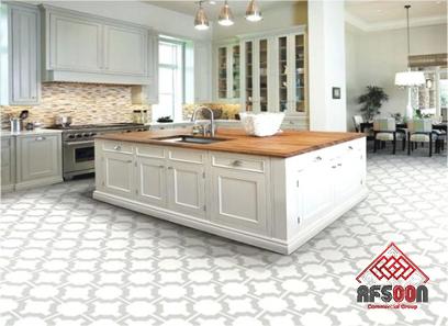
White 900×900 ceramic tiles are considered a proper tile to match almost every design. For the small kitchen, there are some tips that can make them look bigger. If you’re designing a small kitchen, every element you bring into the space matters, including the kitchen tiles you choose.
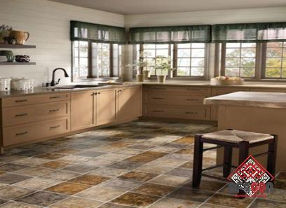
Finding the right small kitchen tile can mean the difference between a stunning kitchen design and a bland design. There are two options for a small kitchen: try to make it look big or make it cozy. Large-scale floor tiles with grout add a feeling of If you want your kitchen to be cozy, choose a warm color that matches your cabinetry.
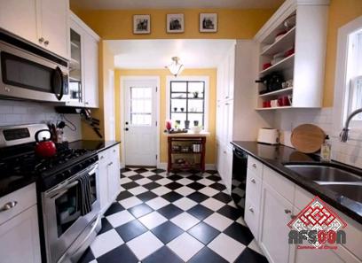
It is important to choose the right tile size so that it is as large and bright as possible. But it’s not just about size: using dark tiles in the wrong places in the kitchen can make it look smaller.
Conversely, reflective tiles are a great way to make a kitchen look lighter, while diagonally laying floor tiles can make it appear wider and longer. Another tip for making a small kitchen bigger is to use the same wall and floor tiles.
Rectangular tiles laid vertically will make the room appear taller; lay them horizontally and the room will appear wider or longer. Color is also an important factor: using a palette that flows seamlessly from single tiles will create a cohesive look. If your unit is white, use bright mosaic tiles for backsplashes or under cabinets to add character.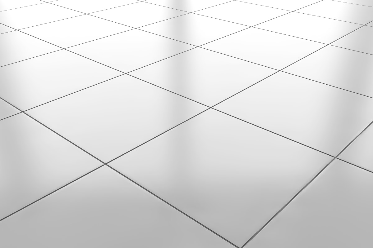
- Replace tiles with glass tiles
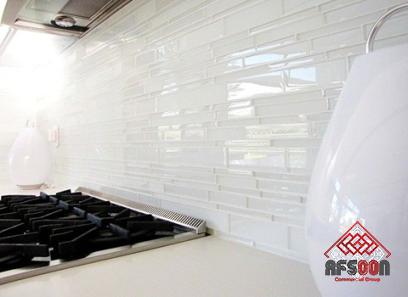
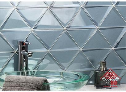
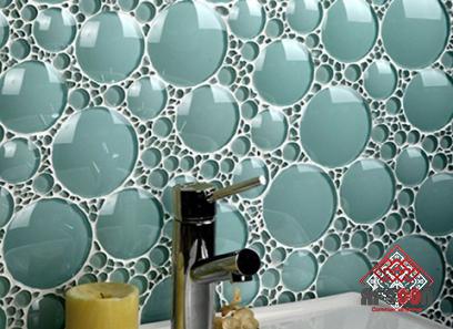
This is the perfect tiling idea for a small kitchen – replace your backsplash with glass tiles to give your space a more open feel. The glass also lets in lots of light, making the space less isolated from the rest of the house.
- Cover an entire wall in a small kitchen
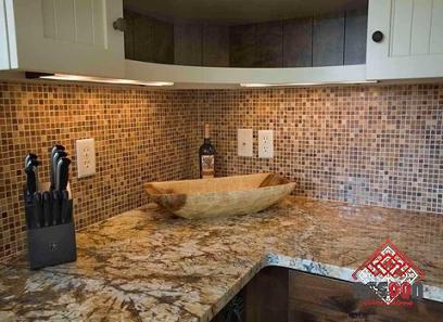
We’re sure we’ve said this before; keep it simple in a small kitchen, but we’d raise our hands and say we’re wrong, bold patterns and colorful tiles work well in small spaces. Small geometric patterns like this almost blur the edges of the room to create a hint of larger space.
- Select the trend grid thumbnail
Bright colors are also available. This sunny yellow brings dark, dramatic cabinetry to life, and the simple grid design of square tiles is a big trend. If you go for this layout, choose a tile with a bit of texture to keep it from looking flat.
- Choose marble tiles for a light and luxurious look
Marble kitchens are another big kitchen trend, and you can bring this luxurious material into your space with tile. Of course, they don’t have to be real marble either, and if you’re renovating your kitchen on a budget, you can opt for beautiful marble-effect tiles.
- Choose tiles that match the color of your cabinets
If you choose a backsplash for your kitchen that matches the color of your kitchen units, you will create a space that looks bigger than the color contrast. Ought to learn how to tile a backsplash? Placing them in a grid pattern like this creates vertical and horizontal lines that evoke their own visual trick: to make the space they occupy appear larger.
- Choose tiles with reflective glitter
If you like dark wall tiles, see if you can find a finish with a reflective quality. Any material that reflects light creates a feeling of space because it reflects light. We love the luxurious look of retro mirror tiles (check out Rough Old Glass), but if you’re looking for something more subtle, tiles with a slight metallic sheen will have a similar effect.
- Create Diagonals
Laying tiles diagonally – or opting for grid tile tiles with a diagonal pattern – is another easy way to create a visual trick that stretches the space, perfect for backsplashes where you want to feel taller in rooms. limited areas.
- Paint the wall behind the tiles the same color
Remember when we talked about choosing tiles that match the tone of your cabinetry? If you also match their color with the color of the wall behind you, you will create the significant space-stretching effect you are looking for.
Do you have a budget? You can always paint tiles to match your kitchen walls, it’s really easy, just check out our tile painting guide.
- Limit Dark Colors to Under Cabinets
Another color tip? Putting darker shades below the waist/cabinet level and lighter shades above will help make a small space look bigger. These dark metal tiles are perfectly positioned and their shimmering finish reflects light, adding depth and interest.
- Use a chevron pattern to stretch the space
Considering diagonal tile laying skills, the herringbone pattern will do the same and give you an elegant look. This pattern tends to be busy, so choose tone-on-tone tiles instead of contrasting tiles for small kitchen designs.
- Love mode? keep one area
In a large kitchen, you can splash patterns on the walls and floors; in a small kitchen, keep the pattern in one area only when the room seems spacious.
- Lay a diagonal pattern on the floor
Do you remember the diagonal tile trick (again)? It works great on walls, but it has a bigger impact on the kitchen floor, stretching and expanding the whole room (at least visually).
- Also use the herringbone tile trick on the floor
Just like on the walls, the herringbone pattern on the floor creates eye-catching lines, making the kitchen floor appear wider and longer. What are the advantages of choosing glossy finish tiles? The reflected light makes the room look greater and shinier.
- Make your tailgate the focal point
Sometimes you don’t need to use visual tricks and reflective surfaces to work your magic. Choosing a bold, colorful or beautifully patterned backsplash can create an eye-catching feature wall. This alone represents a negligible proportion of the room.
- Spruce up a narrow kitchen with stripes
You can make a narrow galley kitchen feel wider with tile patterns – just create subtle stripes in the horizontal lines on the walls. You can make a similar trick with vertical lines – in this case, to make the room higher. Keep the contrast between tiles to a minimum, anything too strong will have the opposite effect.
- Choose terrazzo to create the illusion of space
My favorite for the impression of space is always the terrazzo. It’s a versatile tile, and the pattern simply breaks up walls, giving the illusion of a larger space. We love the Porcelain Superstore Arlo tiles in this matte red kitchen. Moody terrazzo stains make a great backsplash and also a feature wall idea, and they pack a punch.

Your comment submitted.